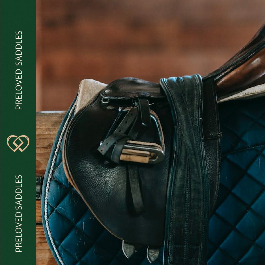
Founded in 1986, Riders Saddlery is at the very heart of the South African Equestrian Community. After many years in business, they wanted to reposition as an accesible, passionate, community centric hub for all horse lovers.

Telling the story of a shop packed with passion.
When Michelle approached us to rebrand the store, it was because she wanted to move away from the idea of Horse Riding as being something inaccessible, and competitive. She wanted the shop to become a place where equestrians of all levels could come to find accessible gear, professional advice and a friendly face without feeling judged or pressured.
At the center of the branding, we wanted a logo mark which would represent the core brand values, passion for horses and supportive community. We combined the idea of a heart, which bring the idea of passion, and with two interlocking stirrup irons. The Irons are easily recognisable to any equestrian, and the interlocking symbolising community and support.

-
Bianca is creative in the best way. She really hears what you are saying and brings to life what you didn't even know you wanted. She really grasps the motivations behind your brand.
Michelle Butler - Riders Saddlery
Versatile Logo Suite

Reworking the brand colour and tyography.
For the colour palette and typography, we wanted to create a warm and welcoming tone for the branding, while also celebrating the stores over-35 years of expertise and experience. We also wanted to avoid the navy, red and white combination that dominates the equestrian industry, and which was previously used for the Riders brand.
We chose a warm and inviting green as our base colour to create a down to earth, dependable and friendly feeling, and added a hint of dusky gold, alongside a friendly, yet elegant serif font to bring in the aspects of expertise and tradition.


