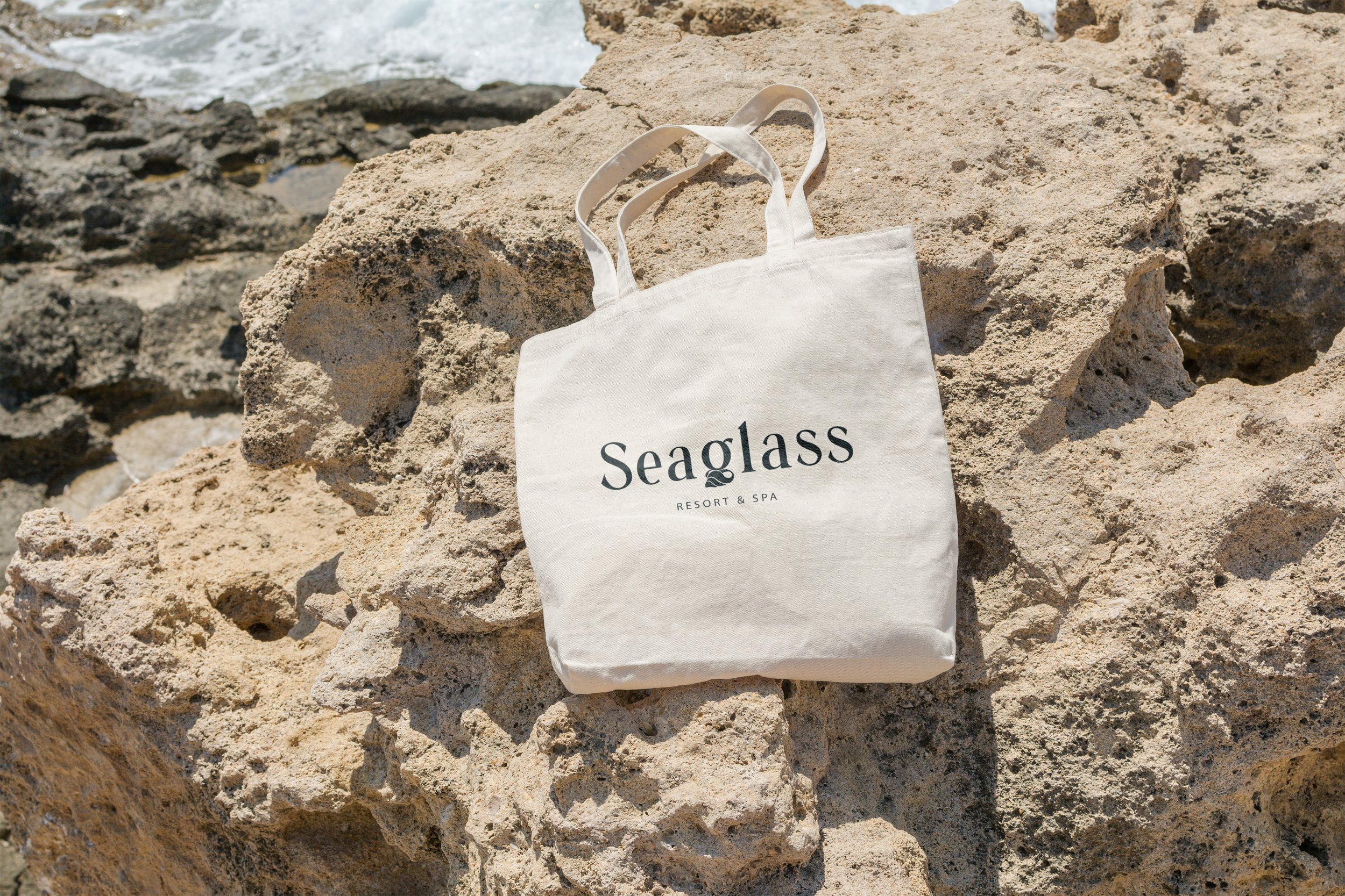
Seaglass is a luxury resort & spa focused on finding relaxation through reconnecting with nature and the ocean. This is a conceptual project.

Creating the feeling of serenity through simplicity
To capture the feeling of calm and relaxation, we wanted to keep this branding minimalist and elegant, to keep the focus on the beautiful ocean imagery and to avoid visual overwhelm.
for the logo suite, we based the logos on a minimalistic, yet elegant display serif, with tall elegant letters for a sophisticated feel. We modified the tail of the ‘g’ to seamlessly form a conch shell to symbolise a connection with the sea.

Versatile Logo Suite

Colours and shapes inspired by nature.
In keeping with the idea of connection to nature, we decided to take our colour inspiration from the natural tones of the sea. To keep the feeling elegant and subtle, we used a deep stone grey and sea foam white, complimented by occasional accents of turquoise.
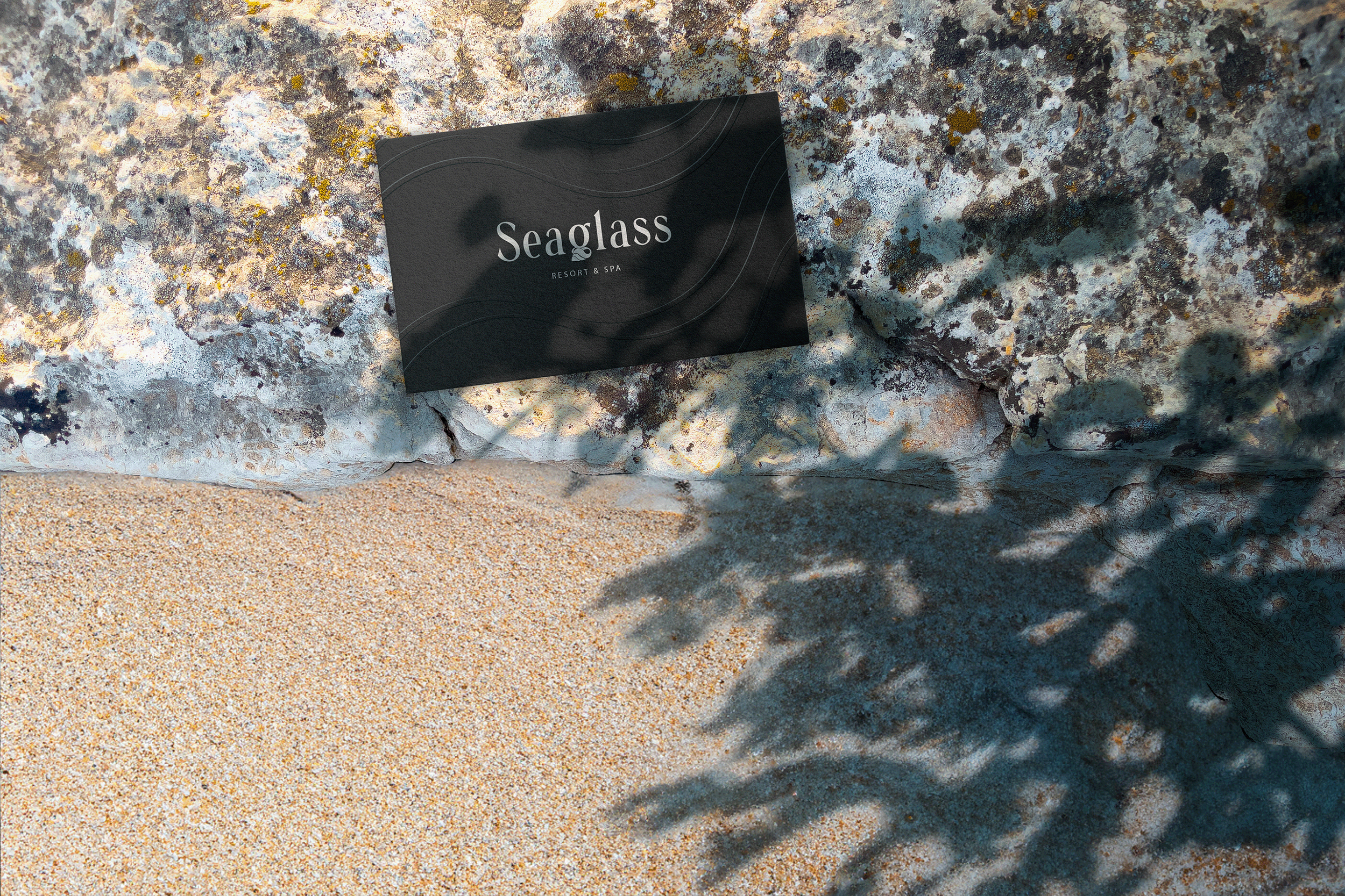
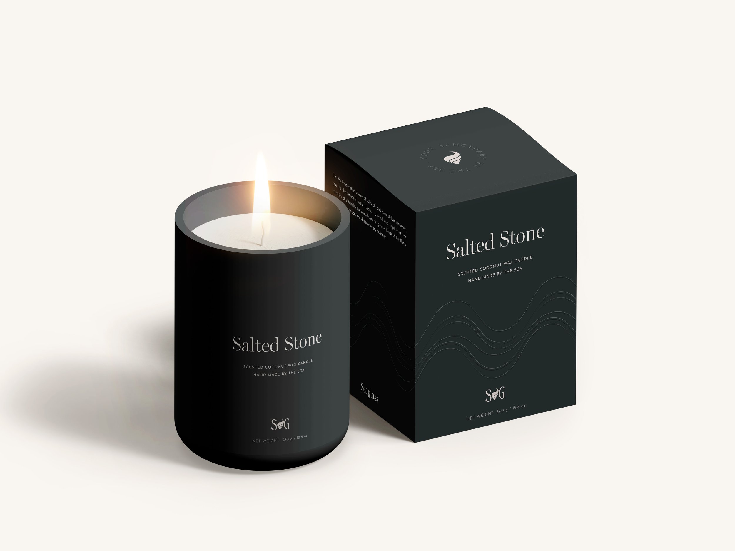
Throughout the branding, we also use a subtle wave motif. The curved, organic lines have a serene feel and bring to mind sitting on the sea shore watching the waves ebb and flow.
Printing with the focus on touch and feel.
Rather than create a purely visual experience for the packaging, we wanted to bring in the element of touch, to engage the customer on more than one level and create a serene moment of focus.
Using embossing allows us to include the aspect of feel, as well as to include extra design elements without losing the calm and minimalistic feel of the pack. It also helps to create a luxurious


