Popsicle Professional Nails approached us for an improved packaging system and visual refresh based on their existing branding.


Step 1: Creating an on-brand packaging system
Our journey with Popsicle started when the founder approached us after having received feedback from her customers that they were missing the fun, vibrant feeling of her brand in her packaging. With a fast growing business and product range, she felt it was time for a refresh.
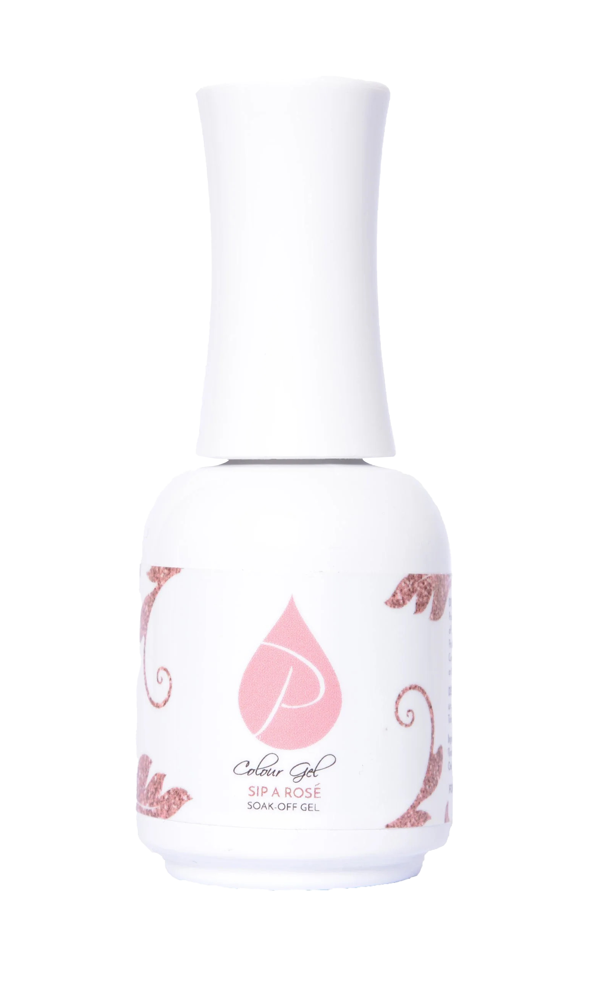
Looking back at the some examples of the original packaging range, we could could indeed see a lack of brand presence on the brand’s hero - the UV Gel range and a general lack of consistency in the use of the brand as well as a lack of consistent styling across ranges, making potential expansions more difficult.
BEFORE
AFTER
So, what did we do?
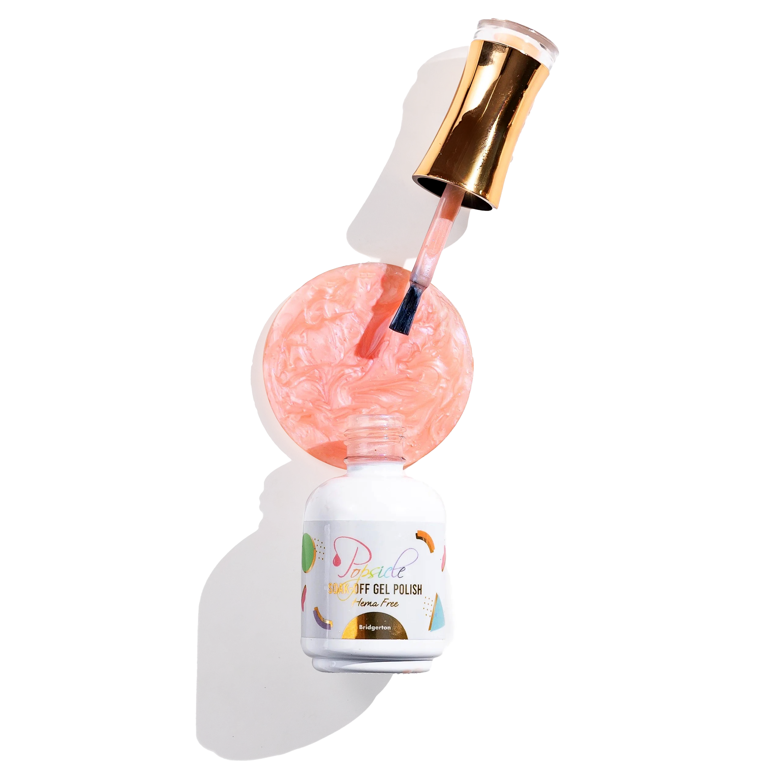
To help better establish the brand on a packaging level, we made the decision to roll back the submark logo on the front face of the packaging, in favour of the full brand name. We also reintroduced the brand shapes in simpler, cleaner way to all products as a red thread through all ranges,.
We also refined the informational layout on the pack, and introduced a consistent foiling system that carries through on all products, making it easy to diversify and extend ranges.


Showing off products authentically
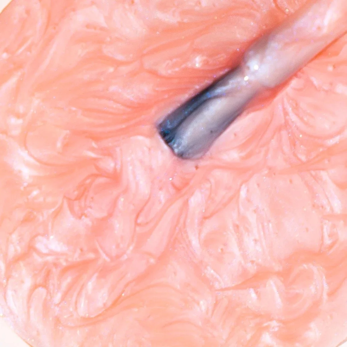
Previously, Popsicle had used a flat vector drop with a swatch of the colour to show off their products, as well as coloured swirls on the side of pack. This made it difficult to show off accurate colours, and the textures of the products were lost completely (especially pearlescent or glitter based products).
To solve the problem, we decided on a 3 shot format for product photography, where the cover image is the bottle including a real life sample of the colour shown in a brand shape (in this case a circle), a macro shot of the product in detail, and a shot showing the product on various skin tones.


