Sara Janasz is a Case Study copywriter specialised in helping Femtech start ups flourish through the power of customer stories.

Representing the idea of a journey.
The Sara Janasz logo is made up of the initials S & J, formed from two simple curved shapes. The fluid shape of the logo brings the feeling of flexibility & creativity to the brand, but the core meaning is the idea of a journey. Case studies document the customers story, and we wanted to bring this through from the very core of the brand. The simple curved shapes of the logo are representative of the different pathways and intersections we take through our lives.
The gentle curves, when used freely, also make for a great ‘red thread’ element that can be carried through various assets.
Responsive logo suite

-
It was fun, easy and exciting to see my brand develop. It’s almost like Bianca is a mind reader, understanding what will work for me and my company. She was recommended to me, and now I’m recommending her to you!
Sara Janasz
Confident, fresh and positive.
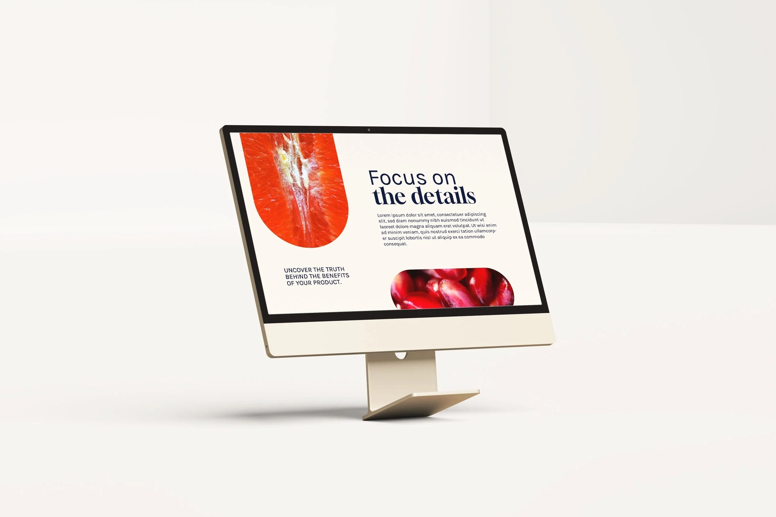
We wanted the branding to feel vibrant and welcoming, and so focused on combining fresh, highly contrasting colours and bold, personality packed typography which, when used alongside the brand pathways and pill shaped image frames, create a fun and dynamic visual system.
As a final touch, we decided to bring in the macro photography as a theme through the brand, representative of focussing in on the details. For the most part, we chose to use fruit and flowers, which are often used to represent femininity, to tie back to the Femtech industry.


